
Websites
One-page website vs full website: what does a local business actually need?
A larger website is not automatically a better website. This guide helps local business owners choose between a focused one-page site and a fuller multi-page build based on real customer journeys, operational complexity, and what the business can maintain properly.
A “proper website” does not automatically need five pages.
It does not need a Home page, About page, Services page, Gallery page, Contact page, and Blog simply because that is what websites are expected to have.
Sometimes that structure is useful.
Sometimes it takes information that could have been clear in one place and spreads it across several thin pages.
I think the more useful question for a local business is not:
“How many pages should my website have?”
It is:
“How much space does a customer genuinely need to understand the business, trust it, and take the right next step?”
For many independent businesses, one well-organised page can do that job properly.
For others, trying to force everything onto one page creates a long, crowded experience that is difficult to understand and maintain. That is when a fuller website starts to make sense.
The answer depends on the real complexity of the business, not how large or professional the owner wants the website to appear.
If you are still deciding whether you need a website at all, start with Does a small local business need a website in 2026?.
This guide starts one step later: you have decided that an owned website would be useful. Now you need to decide how much website you actually need.
Quick answer
A one-page website is often enough when:
- the business has one main audience
- the offer is reasonably easy to explain
- customers follow one or two clear routes, such as calling, booking, visiting, or requesting a quote
- the important proof and practical details can be organised without overwhelming the page
- there is no genuine need for complex functionality
A fuller multi-page website becomes useful when:
- different services need substantially different explanations
- the business serves several distinct audiences
- there are multiple locations, teams, departments, or customer journeys
- customers need detailed information before acting
- the business needs ecommerce, accounts, advanced booking, resources, or other operational features
- putting everything onto one page would make the information less clear
A one-page website is not automatically basic.
A multi-page website is not automatically better.
The right choice is the smallest structure that explains the real business clearly.
What a one-page website actually is
A one-page website is not necessarily a temporary holding page or a single screen with a logo and phone number.
A good one-page website can contain a complete, structured journey through the business:
- a clear introduction
- the main services or offer
- who the business is for
- photos of the real work or place
- trust signals such as reviews, experience, awards, or qualifications
- practical information
- frequently asked questions
- opening hours or areas served
- contact, booking, directions, or enquiry routes
The navigation can still help visitors move directly to each section. The page can still feel professional, substantial, and complete.
That distinction is not always obvious.
From the field
When I showed a one-page Presence example to a local boxing coach in Cardiff, he pointed at the navigation links (About, Services, Gallery, and Contact) and asked what I meant by “one page”. To him, it looked as though the website had several pages.
But those links were moving him to different sections of the same page. They were not opening separate pages or separate website addresses.
I found that reaction useful. A well-structured one-page website can feel like a complete website. “One page” does not mean one screen, very little content, or no navigation. It means the customer can move through the full story of the business without loading several separate pages.
The difference is that everything forms one connected journey rather than asking the customer to move between several separate pages.
That can be a strength.
A new customer does not always arrive wanting to explore a website. They may have been referred by a friend, found the business through Google, followed a link from Instagram, or scanned a business card.
They often want to answer a few practical questions:
- Is this the right business for me?
- Can I trust it?
- Where is it?
- What does it offer?
- What should I do next?
If one page can answer those questions comfortably, adding more pages may not make the decision any easier.
When one page is probably enough
The business has one main story
A barber, personal trainer, independent café, beauty professional, massage therapist, local tradesperson, maker, takeaway, or small consultancy may have several individual services without having several completely different customer journeys.
The customer still needs one overall explanation of the business.
For example, a barber may offer haircuts, skin fades, beard trims, hot-towel shaves, children’s cuts, and grooming extras.
Those are different services, but they do not necessarily need six separate pages. They can sit together inside one clear services section, supported by prices or starting points, photos, reviews, opening hours, location, and contact details.
The business has multiple services.
It does not necessarily have multiple stories.
Customers take one clear next step
One page works particularly well when the main action is simple:
- call
- send a WhatsApp message
- book through an external booking system
- visit the premises
- request a quote
- get directions
- follow a shop or marketplace link
There may be more than one button, but the customer journey is still easy to understand.
A visitor learns enough, gains confidence, and acts.
The useful information fits naturally
A page can be long without being confusing.
Length is not automatically the problem. Poor organisation is.
If the content can be divided into clear sections, each answering a real customer question, one page may remain the simplest option.
The problem begins when each section needs several subsections, large amounts of explanation, different proof, different calls to action, or completely different language for different audiences.
The business wants something easier to manage
Every page creates another surface that can become outdated.
Services change. Team members leave. Prices move. Photos age. Links break. Locations change. Old blog posts remain visible. Text that once sounded accurate slowly stops matching the business.
A focused one-page website gives a small business fewer places to maintain.
That does not mean it requires no work. It still needs accurate hours, current contact information, relevant images, useful copy, functioning links, and occasional review.
But the maintenance burden is usually easier to understand.
A one-page website is not the same as a landing page
The terms are sometimes used as though they mean the same thing, but they often serve different purposes.
A one-page business website can be the main online home of the business. It gives a rounded explanation of what the business is, what it offers, why it is trustworthy, and how someone can act.
A landing page is normally more focused.
It may be built for:
- one advertising campaign
- one service
- one offer
- one audience
- one event
- one conversion action
A local business might have a complete one-page website and later create a separate landing page for a specific campaign.
So choosing a one-page website does not mean the business is limited to one page forever.
It means the core business does not currently need more.
When a full website starts to make sense
Different services need genuinely different explanations
A trades business may offer domestic installations, commercial contracts, emergency repairs, maintenance agreements, and specialist compliance work.
Those services may involve:
- different customers
- different questions
- different evidence
- different project values
- different enquiry routes
Trying to explain all of that in one services grid may leave every service feeling thin.
Separate pages can then help each customer find the information that is relevant to them without reading through unrelated material.
The test is not whether the service names are different.
It is whether the customer decisions are different.
The business serves distinct audiences
A clinic may serve private patients, referring professionals, employers, and insurance-funded clients.
A training provider may serve individuals, organisations, schools, and funded programmes.
A venue may serve weddings, private parties, corporate events, and community groups.
When each audience needs different reassurance, processes, evidence, or next steps, dedicated pages can make the website clearer.
One page should not force several audiences to work out which parts apply to them.
There are multiple locations
A business with several locations may need separate information for each:
- address
- opening hours
- team
- services
- parking
- accessibility
- contact details
- directions
- local context
A single locations section may work for two simple branches.
As the number or differences increase, dedicated location pages become more useful to customers.
They can also provide a stable destination for each location’s Google Business Profile and local communications, without claiming that creating pages alone guarantees search rankings.
Customers need substantial detail before acting
Some decisions require more explanation.
A person choosing a barber may be comfortable after seeing services, photos, reviews, prices, and location.
A person choosing a specialist clinic, legal service, architect, major home-improvement contractor, or high-value business supplier may need much more:
- detailed services
- processes
- qualifications
- case studies
- regulatory information
- team expertise
- expected timescales
- detailed FAQs
- examples of previous work
That information should not be reduced purely to protect a one-page format.
If the customer needs detail to make a confident decision, give the detail enough room.
The website performs an operational job
A fuller website is also justified when it needs to do more than explain and direct.
That might include:
- ecommerce
- customer accounts
- complex appointment booking
- membership
- course delivery
- large searchable catalogues
- job applications
- document or resource libraries
- quote builders
- integrations with internal systems
- different forms for different services
At that point, the structure should be designed around the operation itself.
It is no longer simply a question of how much marketing copy fits on one page.
Signs you are squeezing too much into one page
A one-page website may be too small when:
- the navigation contains a long list of sections
- important services receive only one vague sentence each
- different audiences are mixed together
- visitors repeatedly ask questions that the page supposedly answers
- the page has several unrelated calls to action
- the same proof does not apply to every service
- it becomes difficult to send someone directly to the information they need
- every update requires rearranging the whole page
- the page feels like several websites stacked vertically
A long page is not automatically bad.
But if the visitor has to search through unrelated content to find the section that applies to them, the structure is no longer helping.
Signs you may be overbuilding a full website
The opposite problem is also common.
A full website may be larger than necessary when:
- several pages contain only a heading and a few sentences
- the About page repeats the homepage
- every small service has been given a near-identical page
- pages exist mainly because they are assumed to be standard
- the business has committed to a blog without anything useful to publish
- the owner struggles to keep information consistent across the site
- the build takes months before any useful version goes live
- the cost and complexity are solving an imagined future need rather than a present customer problem
More pages can create the appearance of depth without creating actual usefulness.
A customer does not benefit from clicking through six pages that each say very little.
Sometimes one carefully written page feels more complete than a thin multi-page website.
A few practical examples
Barber or salon
One page may comfortably cover:
- services
- price guidance
- photos
- opening hours
- reviews
- location
- booking or contact
- common questions
A full site may become useful if there are several branches, a large team with separate specialisms, training courses, product sales, memberships, or extensive treatment information.
Restaurant, café, or takeaway
One page may be enough for:
- the main offer
- menu link or highlights
- dietary notes
- opening hours
- photos
- address
- directions
- booking, ordering, or collection links
A fuller site may make sense for several locations, detailed menus, online ordering, events, private hire, gift cards, recruitment, or several distinct dining experiences.
Trades or home services
One page may work for a focused local tradesperson with a clear service range, areas covered, examples of work, reviews, qualifications, and a quote route.
A full site may be more appropriate when the business serves both commercial and domestic customers, offers several high-value services with different buying journeys, covers several regions, or has substantial case studies and compliance information.
Clinic or professional practice
One page may work for one practitioner with a focused offer and a simple booking process.
A full site may be justified when there are several practitioners, treatments, conditions, referral routes, locations, detailed patient information, or sensitive decisions that require more explanation.
Maker or product-led business
One page may explain the maker, the work, custom-order process, product categories, proof, and link customers to an established Etsy or marketplace shop.
A full ecommerce site becomes useful when there is a large catalogue, stock management, variants, fulfilment rules, customer accounts, or a strategic reason to own the complete buying journey.
A better way to decide
Do not begin by writing a list of pages.
Begin by writing a list of customer journeys.
For each important type of customer, ask:
- What are they trying to understand?
- What might make them hesitate?
- What proof do they need?
- What practical information matters?
- What action should they take?
- Is that journey meaningfully different from the others?
If the journeys overlap heavily, one page may serve them well.
If each journey needs different explanations, proof, questions, and actions, separate pages may be clearer.
Then ask a second question:
Can we add the extra pages honestly and maintain them properly?
A page should exist because it makes something clearer, not because an empty item in the navigation makes the website look larger.
Start with what the business needs now
A one-page website does not lock a business into one page forever.
A focused site can grow when there is a genuine reason:
- a new location opens
- a service becomes substantial enough for its own journey
- customers repeatedly need more information
- the business begins publishing genuinely useful resources
- ecommerce or booking requirements change
- a new audience appears
- real search or sales evidence justifies deeper content
That is a healthier way to grow a website.
Start with the structure that serves the business now.
Expand when real customer or operational complexity appears.
Do not build a large website simply to prepare for every possible version of the business that might exist one day.
Where WeGrow fits
WeGrow Presence is deliberately a focused one-page website product.
That scope is not based on the idea that every business only ever needs one page.
It exists for local independent businesses where one clear, professional page is the right-sized solution: enough room for the offer, useful proof, practical details, photos, FAQs, and customer actions without turning the project into a large build.
For some businesses, that will be enough for a long time.
For others, the business may have several genuine customer journeys and need a fuller website or specialist system instead.
And sometimes the right answer is smaller still: improve Google Business Profile, tidy Instagram, correct the important links, or use Local for the essential details.
The recommendation should follow the business.
The business should not be forced into the product.
If you are unsure what size of website makes sense, see what WeGrow could look like for your business before creating an account.
Because the goal is not to own the most pages.
It is to give each real customer enough clarity to make the right decision.
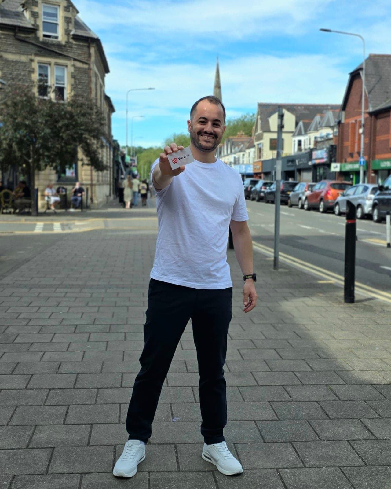
Jad El Omeiri is the founder of WeGrow. He has spent more than twelve years building digital products—from early-stage startups and marketplaces to ecommerce platforms used by millions of people. He now brings that experience into practical, founder-led work with independent businesses in Cardiff and beyond.